


Warm vs Cool Colors
The two broad types of color are warm and cool. Warm colors include red, orange, and yellow, while cool colors include green, blue, and violet. The two categories of color have their own moods, and it helps to ask yourself which ones you’re photographing at a given time if you want to optimize how your photos look.
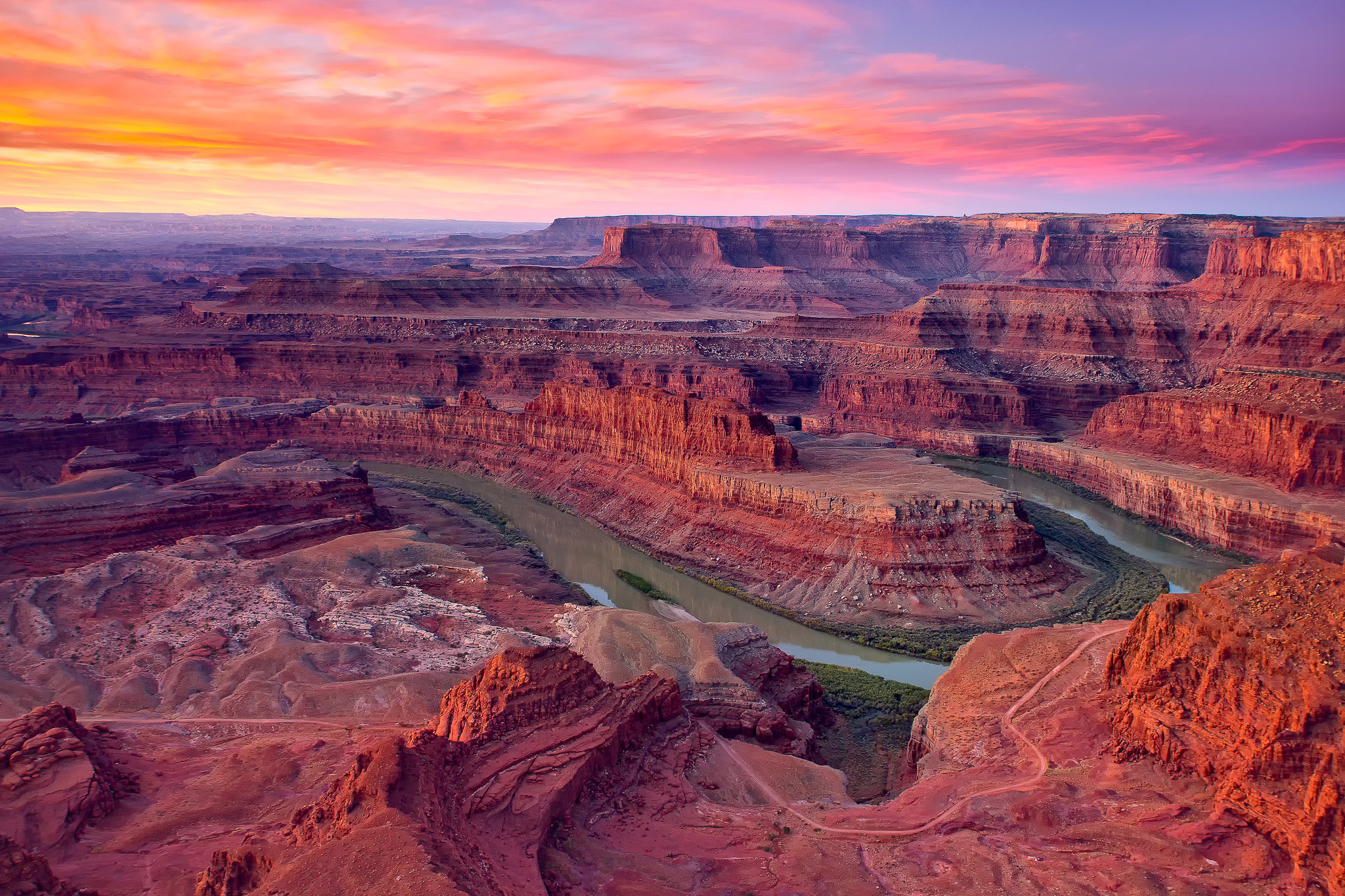
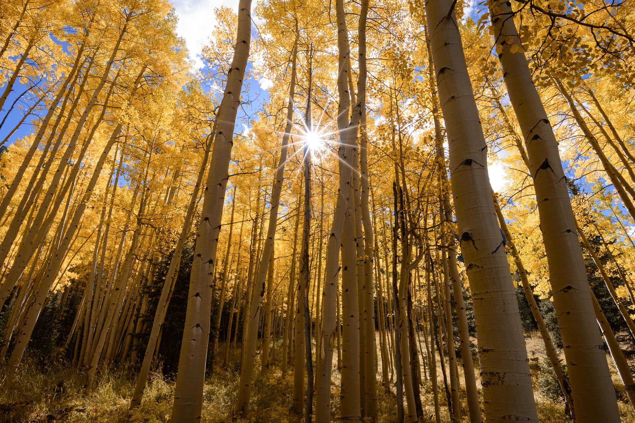
Warm colors are more active and emotionally charged. They jump out at the viewer, attracting attention and drawing interest. In general, warm colors are rarer than cool colors, so an image which has even a small splash of warmth can stand out. This is one reason why photos at sunset and sunrise, as well as fall colors, are as popular as they are.
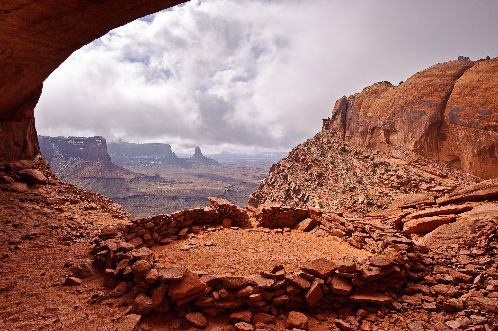
Cool colors, on the other hand, are more subdued and gentle. They fade into the background, particularly if a warm color appears in the same spot. In general, they don’t attract the same degree of attention as a warm color, though that certainly isn’t a bad thing. Warm colors can be overpowering; cool colors are more likely to appear soothing and calm. Much of nature is made of cool colors, although sunset and sunrise can turn even a blue landscape golden.
Below, I’ll cover each of the six main colors – red, orange, yellow, green, blue, and violet – as well as the emotions that are generally associated with each. Keep in mind that emotion is a tricky part of photography to pin down, and you can take pictures which don’t have the following emotions simply by altering your choice of subject or composition. But the following effects do make a difference.
Examining the Emotions of Each Color
Red
As one of the rarest and most powerful colors in nature, red is particularly important to photographers. With the historic associations between the color red and the emotions of passion and excitement, it’s no surprise that this is a very active color. It can also be too intense for certain images; a little red goes a long way.
To find red in nature, look for leaves in autumn, red rocks in places like the American Southwest, or the occasional vivid sunset. In other genres of photography, like portraiture, keep in mind that any red your subject wears will draw the eye, whether clothing or makeup. And with wildlife photography, red subjects – such as the bright eyes of a tree frog or a cardinal against the snow – have immediate sticking power.
Orange
Compared to the color red, orange is one of the more common in nature. It’s not just sunsets, either. The color brown is typically just a darker shade of orange, and it appears in nature all the time.
Orange comes in a wide range of tonalities, from the dark brown of trees to the bright orange of a pumpkin. It conveys a feeling of warmth, and it is not as overpowering as red. But orange isn’t a passive color, either; it draws quite a bit of attention, especially when placed against a cooler background. To me, it always feels like it contains a bit of adventure.
Yellow
Yellow is the brightest and most optimistic color, particularly when it appears on its own and not as a blend with orange or green. However, it is this blended yellow we see most commonly in the world. Even bright green grass and vivid orange sunsets almost always have a component of yellow.
On the other hand, if you keep an eye out for it, you’ll still find yellow on its own in nature. Sand, autumn leaves, and even the sun at certain times of day are all bright yellow, and they work well in photos where your goal is a sense of positivity and excitement. Like red and orange, yellow is a warm color, and it draws the eye whenever it appears. Look close enough, and you’ll find ways to include it in your photography.
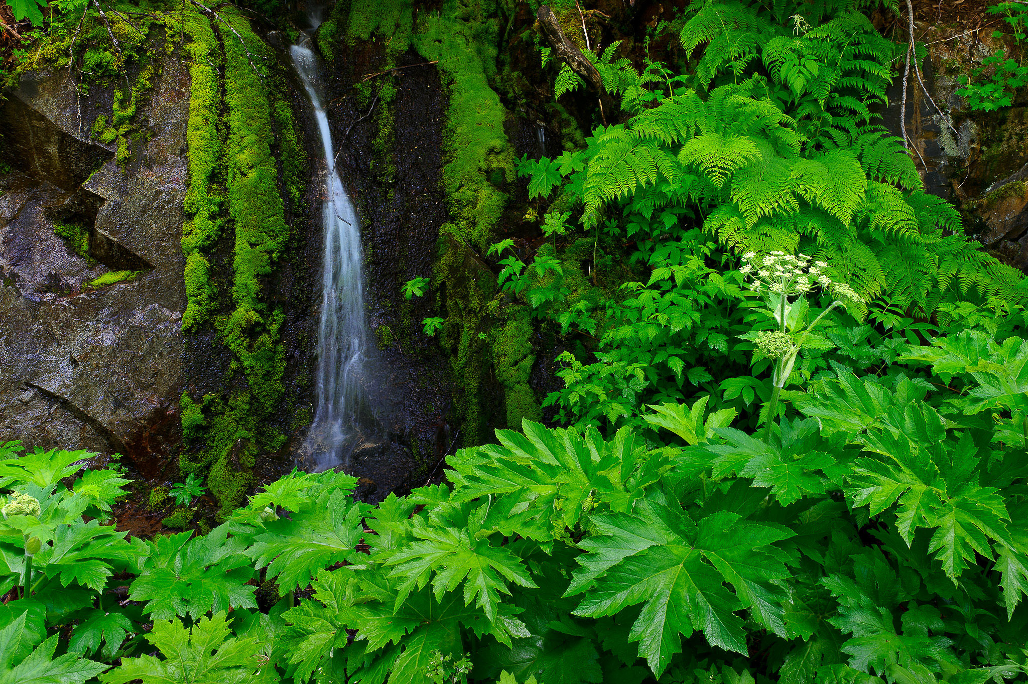
Green
Even though blue is the most common color in nature, thanks to water and sky, green is the one we most associate with life. Our visual systems recognize more shades of green than any other color. So, your photographs can include shades of deep green, vivid green, electric green, dark green, bright green, and almost endless variations thereof.
At its heart, though, green is a familiar and soothing color. Because it represents the living world, it creates a sense of calm for those of us who enjoy spending time in nature. In that sense, green is the warmest of the cool colors.
Blue
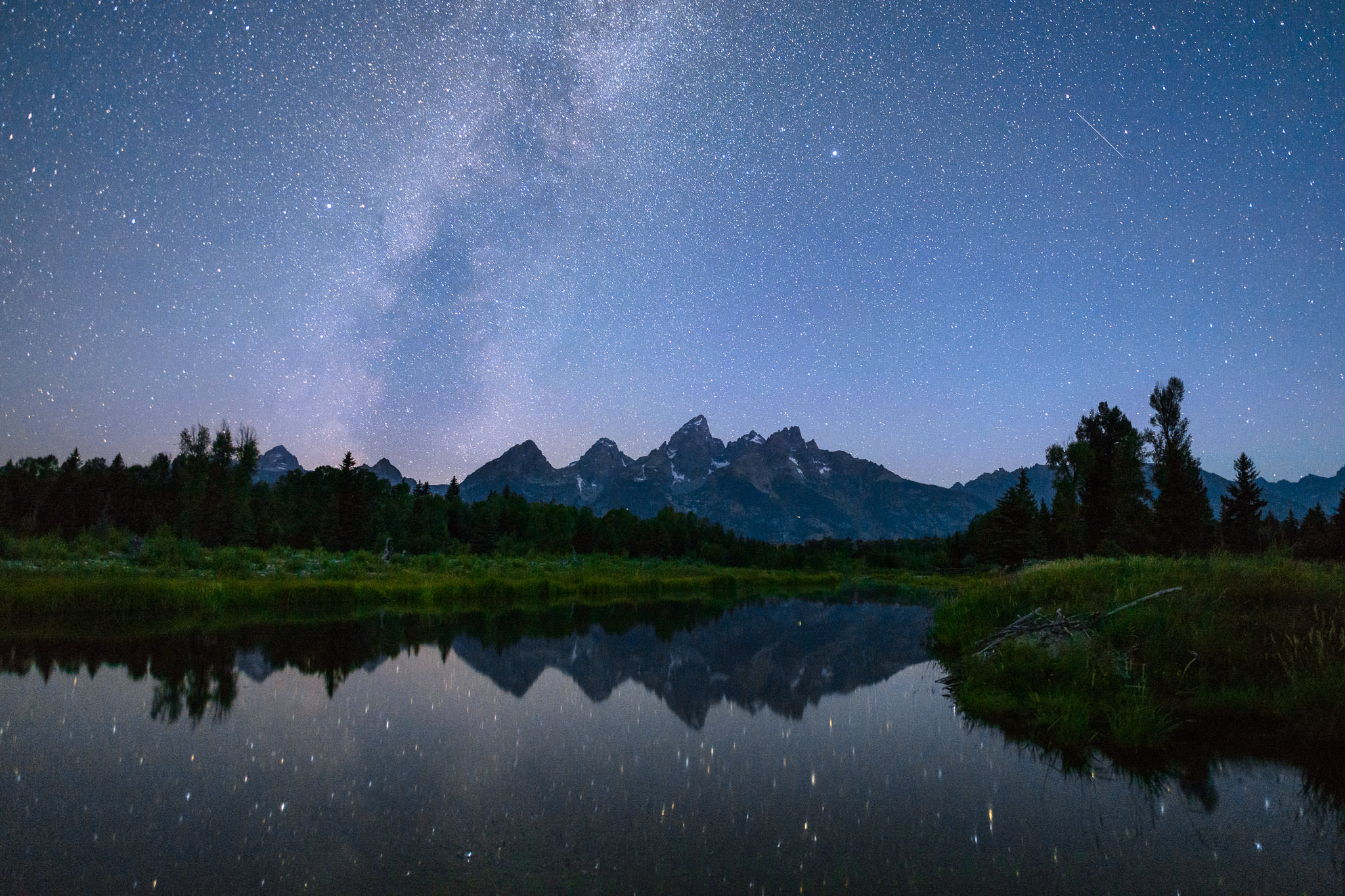
One of the first people to write about the relationship between color and emotion was Goethe in his 1810 Theory of Colors, in which he said that blue “draws us after it.” Today’s prevailing view isn’t so different. Perhaps this is a case where artistic tradition has overtaken reality, but maybe there’s something to it. After all, blue is associated directly with distance in the real world. Haze on the horizon, as well as the blue sky itself, both signal faraway, even unreachable destinations.
Blue, on top of that, is not a busy color. It is calmer and less flashy. A well-known fact of Instagram photography is that blue images get more likes, on average, than those with warmer colors. This is because the busy colors of red and orange do not translate as well to a smaller screen, while blue is not nearly as distracting.
Dark blue and light blue convey somewhat different emotions. Dark blue can be strong and foreboding, as in a dark cloud. Light blue is gentler and more optimistic. But both are peaceful; even a blue storm usually has an element of calm to it.
As the most common color in nature, both in the sky and in water, chances are good that you’ll find the emotions of blue in many of the photos you capture. Whether as the sole color in a calm, deep image or the background to a warm color’s attention-grabbing power, blue can complement most any emotional message in a photo with success.
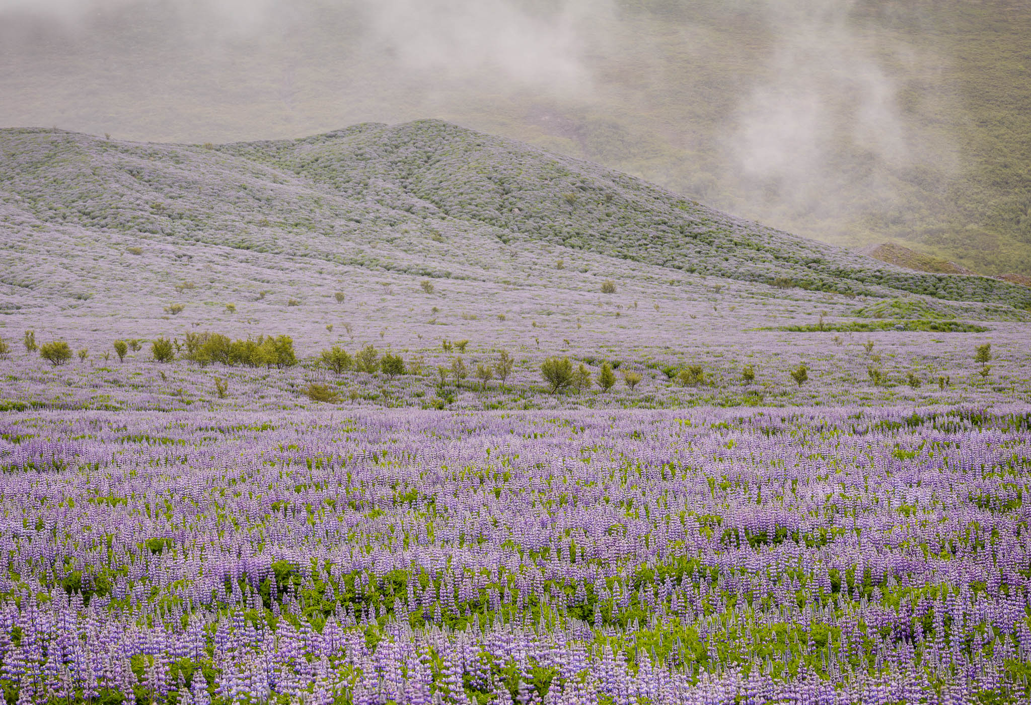
Violet
Violet is perhaps the rarest color to see in its pure form in nature, usually found only in very specific sunsets or flowers. Although historically associated with royalty and riches, the color violet in photography takes on many of the same connotations as blue; in fact, it most commonly appears in the world as a mixture with blue, forming a bluish-violet color in the sky or sea.
The color violet has a sense of tranquility to it – a calmness that is pleasant and often unexpected. If you ever have the chance to photograph a display of this rare color, like lupine flowers in bloom, make the most of it; violet is unusual enough that it makes your photos stand out.
Color Harmonies and Relationships
Just as important as individual colors are the ways in which they interact. This varies from simple color contrasts to complex harmonies; the real world has almost endless variety in color. Some of these relationships work better than others, though it will take a bit of practice – and often some post-processing – to get exactly the result you want.
Warm and Cool Colors
As mentioned a few times so far in this article, the difference between warm and cool colors is an important one. When both types appear clearly in the same photo, they form a strong color contrast that can be a focal point of interest.
In classic color theory, every cool color’s complement (opposite) is a warm color, and vice versa. Red and green are complements; so are orange and blue, as well as yellow and violet.
One important part of complementary colors is that they have inherent contrast when placed next to one another in a photo, similar to a composition that juxtaposes black and white. Take a look at the photo below, for example:
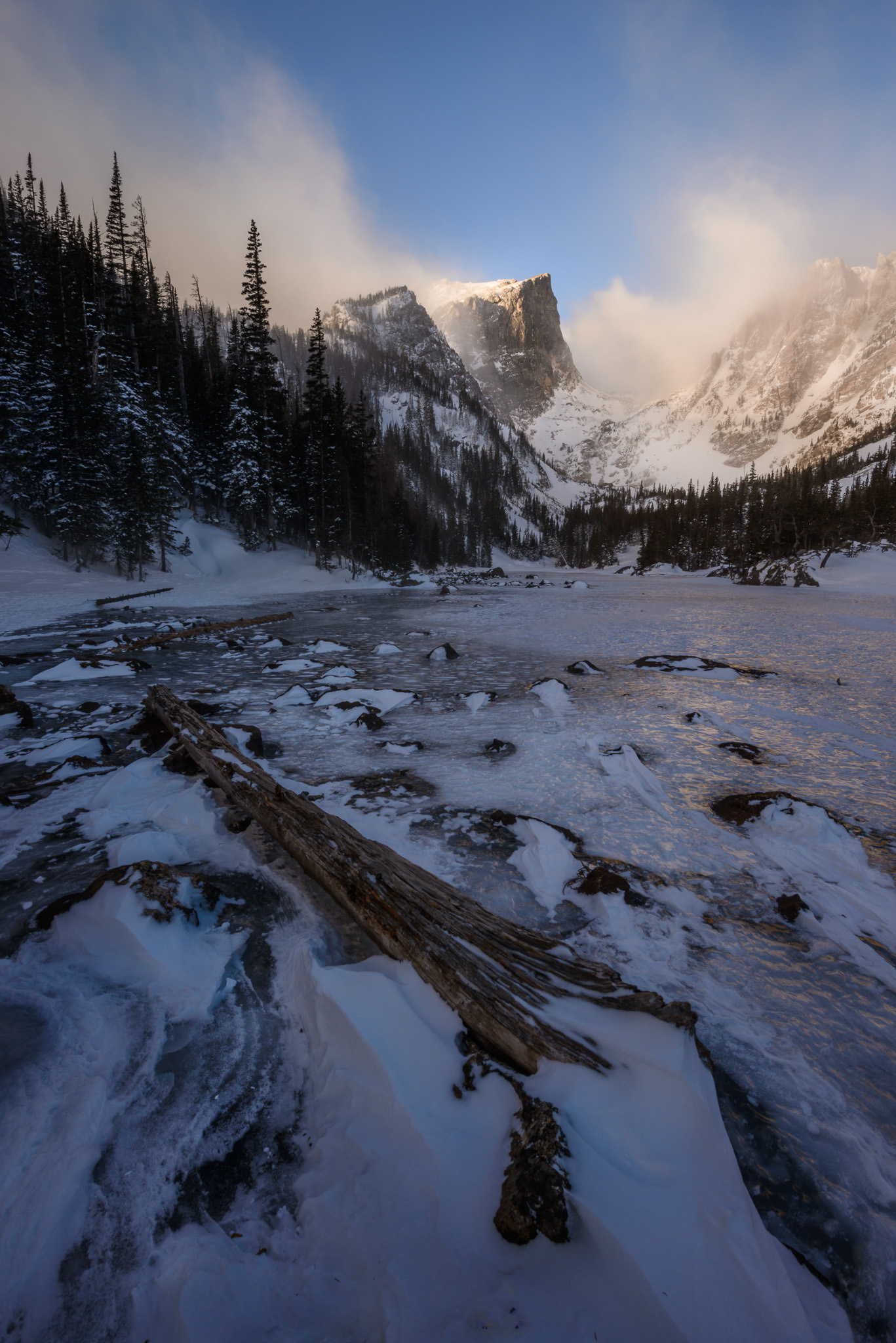
There are only two dominant colors in the image above, blue and yellow-orange, and they intersect in a few different areas. One of the most important is the sky, where the warm cloud sits against a cool background. In the black and white version of this photo, there is very little separation between the two, and therefore not as much attention drawn to the top of the photo. But in color, the strong contrast draws attention to the sky, making it a very important element of composition.
Complementary Colors and Other Relationships
Several other color relationships are said to be attractive, such as a combination of the three primary colors (red, yellow, and blue). The same is true of colors between the ones listed above, like yellow-orange or blue-green, which have their own sets of complements as well.
Although I don’t dismiss the idea that these more complex color harmonies are often beautiful and emotive, the reality is that this discussion can get quite tangled when discussing three or more colors. Quite simply, real-world colors are not like painting. In most cases, you can’t choose a perfect blue-green to harmonize with equal parts red and orange; reality is messier than that.
If you want to delve into deeper discussions on color harmonies and relationships, there is no harm in doing so, and potentially some interesting information to learn. But my main recommendation is just to look at the scene in front of you and try to picture if its color “looks right” to your eye. That is far from be precise, but there’s more value to a gut feeling in photography than in trying to match an ideal that you may not find in the real world.
The one exception is in the post-processing stage, when you have a bit more flexibility to shift the hue and saturation of the colors in your image. In that case, it’s worth spending the time to edit the photo in a way that harmonizes well, either by a color wheel definition or, more probably, just something that looks good to your eye.
Conclusion
Color is one of the deepest topics in photography, but it carries emotions so strongly that it is worth trying to think about its characteristics consciously whenever possible. I often find myself working to make a photo as simple and unified as possible, with just a single color that dominates the frame. Or, if conditions are right, looking for a warm-cool split can result in photos that draw a lot of attention, much like shooting with high contrast.
However, the most important part about color at the end of the day is simply what looks good to your eyes. Whether in the field or in post-production, the colors you choose have a major impact on your personal style; some famous photographers have a “look” to their images that’s largely due to their color palette. So, once you understand the fundamentals of color, it’s best to take this information and make it your own.
I’ve also published a video which dives into some of these topics in more detail, which you may enjoy:

