


I’m a fan of black and white photography. A lot of subjects that fall short in color look evocative and powerful when captured in shades of gray. But it’s not always easy to decide if a photo should be color or black and white. Today, I’ll explain how I choose.
When the Photo Should Be Black and White
I’d categorize three broad reasons why an image should be converted to black and white:
- When the color in the scene is distracting or unsightly
- When the mood evoked by the colors is different from the mood you want to convey
- When you wish to depart somewhat from reality
Let me go through each of those in a bit more detail.
Unappealing Colors
The first reason to shoot in black and white is, simply, that the color of the scene isn’t very good. The photo below is an example of colors that I find unappealing and distracting:
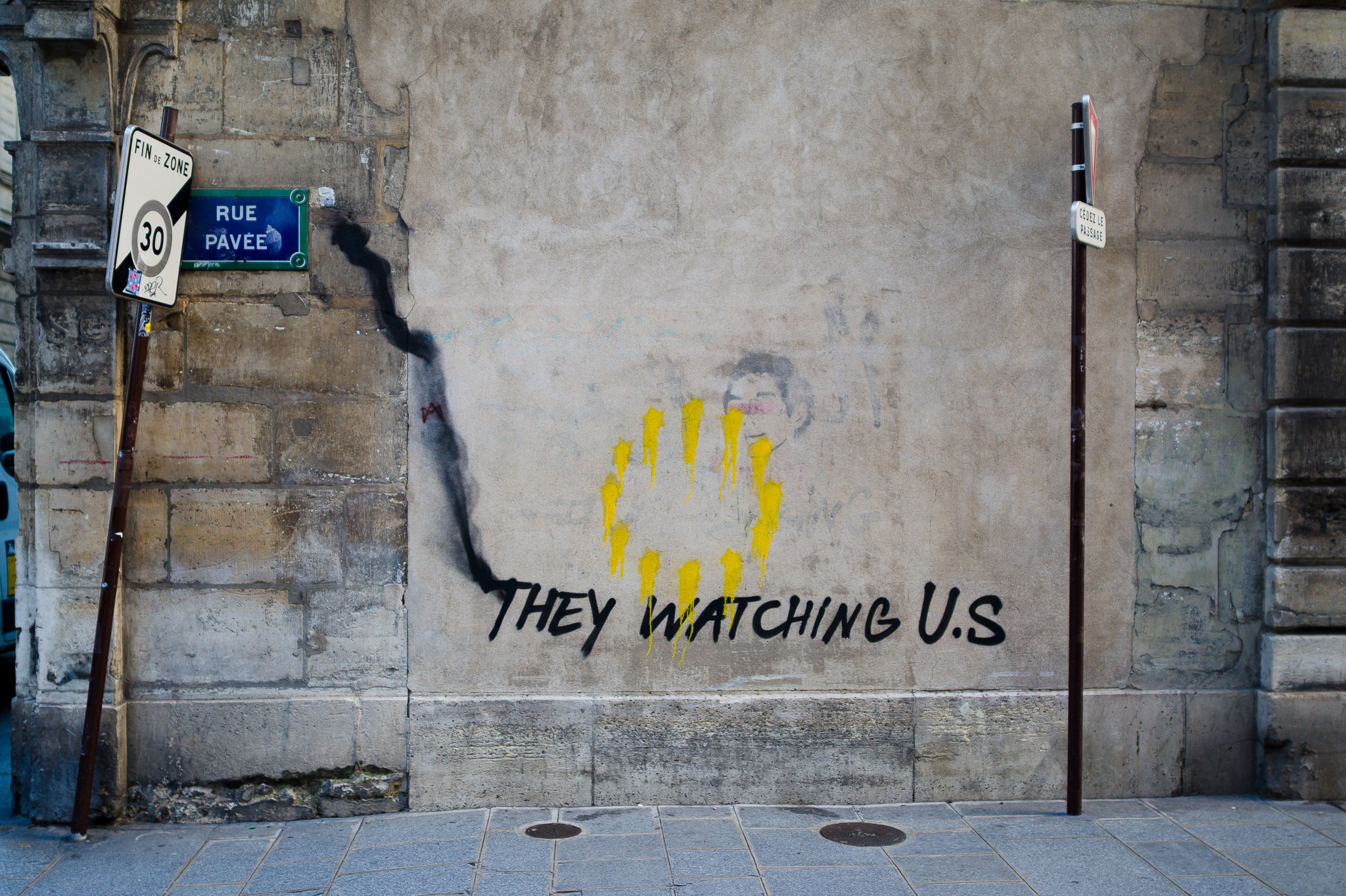
First, the yellow-ish ring in the center of the photo looks a bit odd and doesn’t match well with the tan wall behind it. Second, the signpost on the left-hand side has a distracting, faded circle around the number 30. It’s as if it once was red but lost all its color, and not in a good way. The black and white image fixes these problems and draws more attention to the reason I took this photo – the words, “They watching us.”
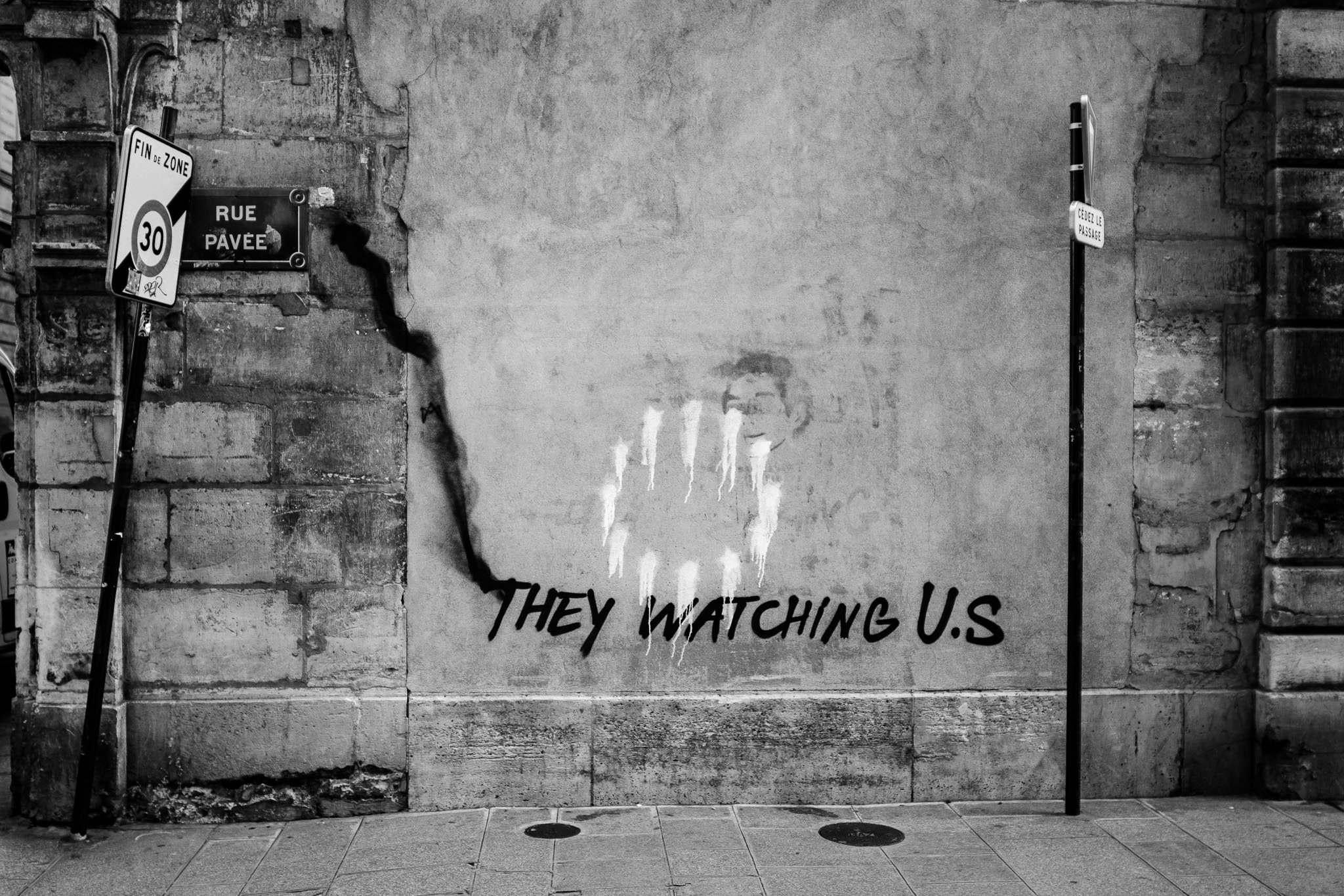
Colors can easily be distractions in a photo, since they’re some of the first things our eyes gravitate toward in a frame. If you consider the colors in your shot to be ugly or distracting, and you don’t want a viewer’s eye to gravitate there, black and white is a great solution.
Unwanted Mood in the Colors
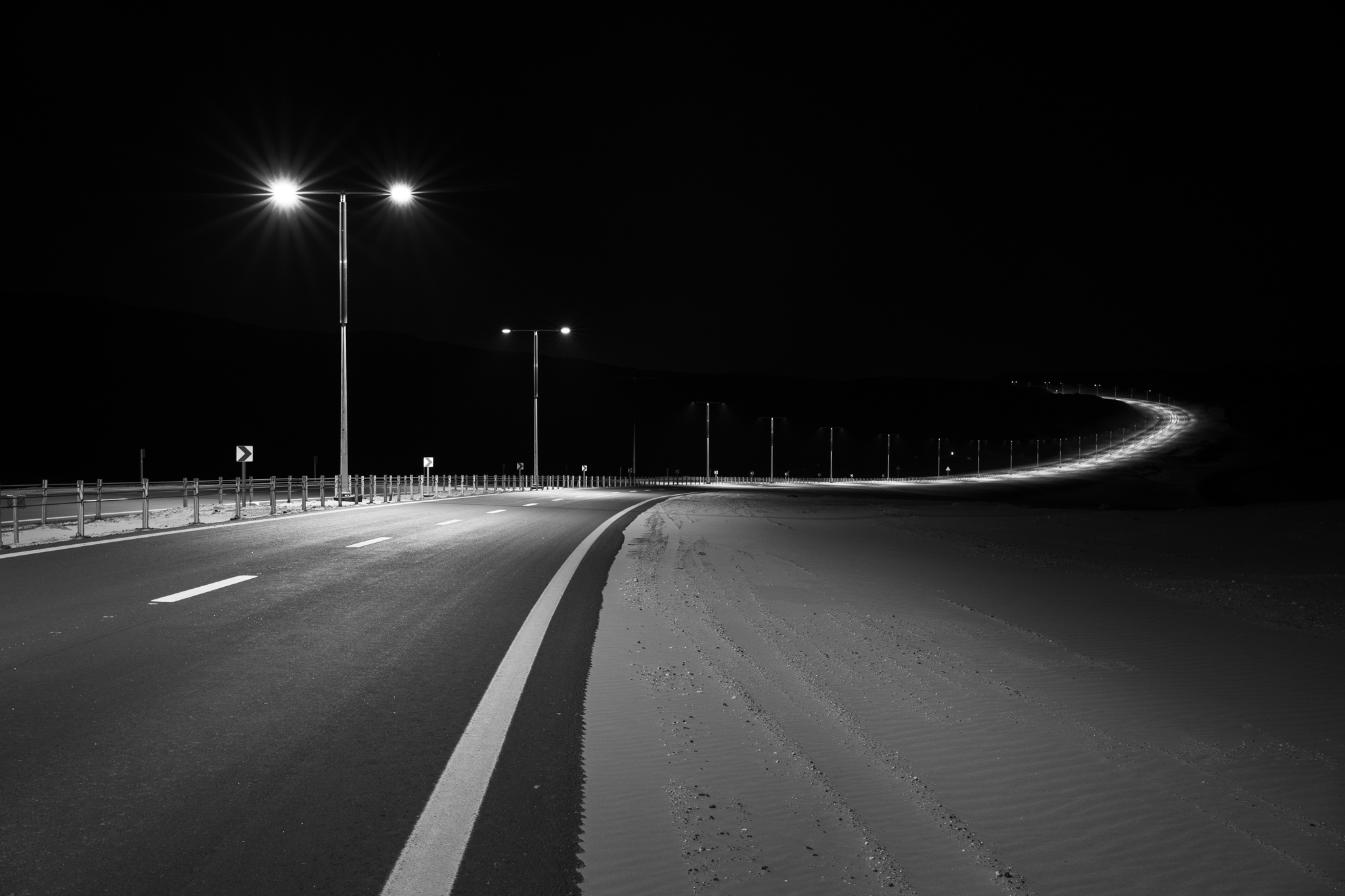
Another way that colors can take away from your image is if they convey the wrong mood. I don’t hate the colors in the photo below, but they aren’t conveying quite the emotional message I would like:

The mood I’m trying to convey in the image above is one of emptiness and isolation (hence the composition with high negative space) along with a bit of a disconcerted feeling (hence the imbalanced composition). My choice of framing is in sync with that message, but the colors in the image aren’t contributing toward it. They’re a bit too warm and inviting; I’m aiming for a colder feeling.
In other words, it’s not that I think the colors in the photo above are unsightly. It’s just that they carry emotions that I don’t want in the photo. Converting to black and white for the image below fixes this impression and better evokes the mood I want.
A Departure from Reality
It’s an obvious statement that the world is not, in fact, black and white (although perhaps it was before the 1930s). In some sense, I’d even consider it surprising that black and white images look as “natural” as they do. They don’t immediately strike us as strange in the same way that a posterized or inverted image might, for example. Even so, black and white is still a departure from reality.
I find this departure to be a useful artistic tool. At times, it can nudge a viewer to consider the artistry behind the image instead of seeing it as a straightforward shot of a literal subject. Depending on the scene, black and white can also have an old-fashioned feel – or timeless, if you prefer – where the image seems like it could have been taken long ago.
Maybe this is the quality that leads some photographers to consider black and white photography a gimmick in today’s digital world. The argument, as I understand it, is that black and white is like another Instagram filter: a “fake” old-timey appearance slapped onto the photo in hopes of getting more clicks.
Of course, I don’t share this opinion. I believe that as photographers and artists, departing from reality is an essential part of the creative process. Other than narrow genres like medical photography or scanning paintings, photography really should do more than just capture a subject accurately and present it straightforwardly. If accuracy is all we ever aimed for, so much of the photographer’s vision and artistry would be lost.
However, as much as I enjoy black and white photography, there are cases where it simply isn’t the right choice for an image. That’s what I’ll cover next.
When the Photo Should Be Color
Like before, I think the reasons to avoid black and white photography can be boiled down to three main categories:
- When the subject needs contrasting colors in order to be comprehensible
- When the colors in the scene set the right mood in the photo
- When realism is essential (or the client/project demands color)
Allow me to explain each one with some examples.
Useful Color Contrasts
Color contrast is when two different colors – and especially opposite colors – are placed adjacent to one another. Both colors may have similar brightness levels, but the image will still have a clear impression of contrast between them.
Here’s a good example of color contrast. Below, the saturated orange colors have nice contrast with the desaturated gray-blue behind it, giving the sand an interesting pattern of stripes:
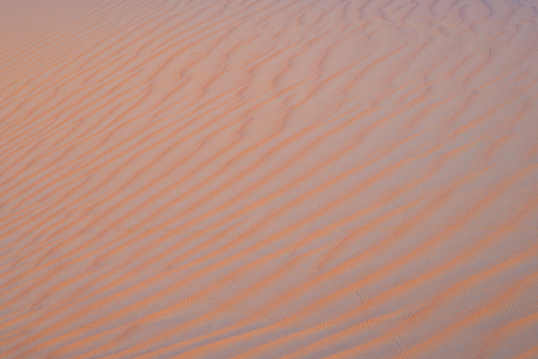
This photo doesn’t work well in black and white, though. As you can see, it loses almost all semblance of a pattern and contrast:
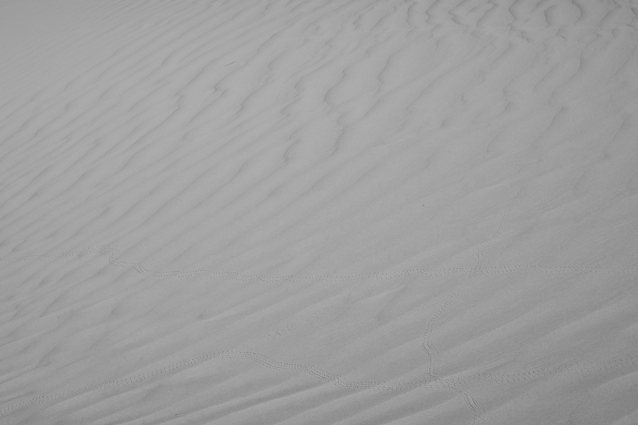
Unless you’re a fan of (very) low-contrast work, I think you’ll agree that the second photo is weaker than the first. Color contrast was essential to making this subject an actual subject. It would take an unreasonable amount of post-processing or in-camera filtration to separate the tones enough to get a usable monochromatic image here.
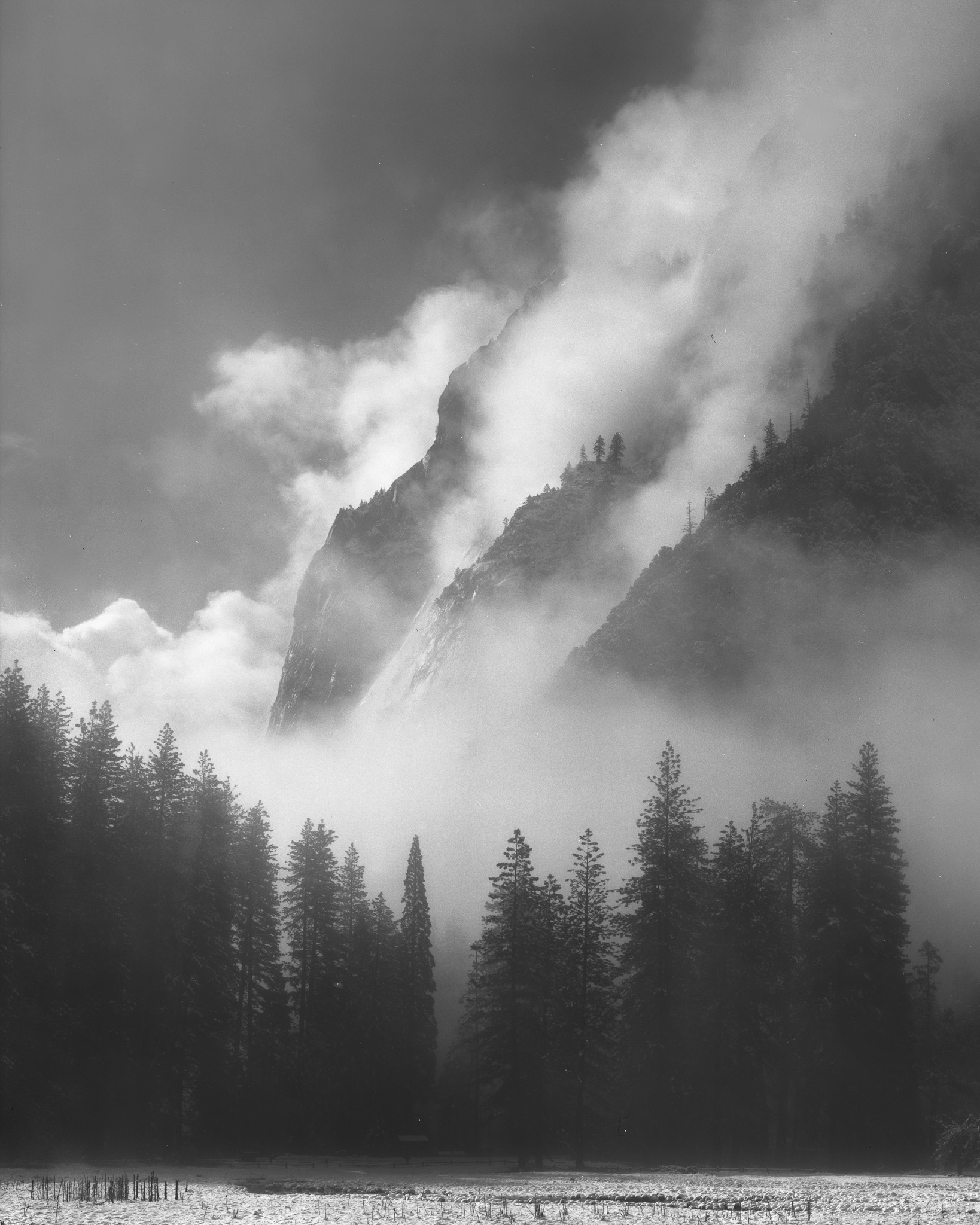
Even though the example above is unusually exaggerated, color contrasts appear all the time in photography and give structure to color images. Let me present two more cases. First is an image of a more standard, “classical” landscape:
I like the lighting here; the bright sidelight does a good job sculpting the foreground, including in black and white. The problem is the mountain in the distance. Since the top of the mountain peak isn’t illuminated, the mountain blends into the clouds too much and loses lots of subject separation in the monochromatic version. (It might be possible to add some separation with local edits in post-processing, but the fact remains that the peak is in shadow.)
Compare that to the image below, which I took while the sun was still shining on the top of the distant mountain
To me, this is much stronger than the other black and white photo. On one hand, I think it’s a slightly more interesting foreground – but more importantly, the mountain and sky actually look like separate objects! This is a case where I might display the one image in color and the other in black and white, but certainly not both in black and white.
Colors That Add to the Mood
Color is one of the single biggest contributors to the mood of a photo. Sometimes it’s such an important contributor that the whole photo could be considered a picture of that color. In cases like that, the black and white variant may still look good in its own right – but it would be missing the extra “oomph” that the helpful, moody color is providing.
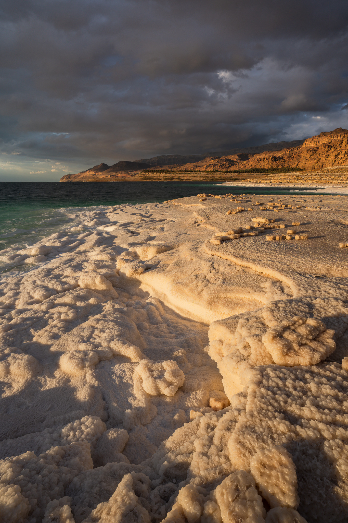
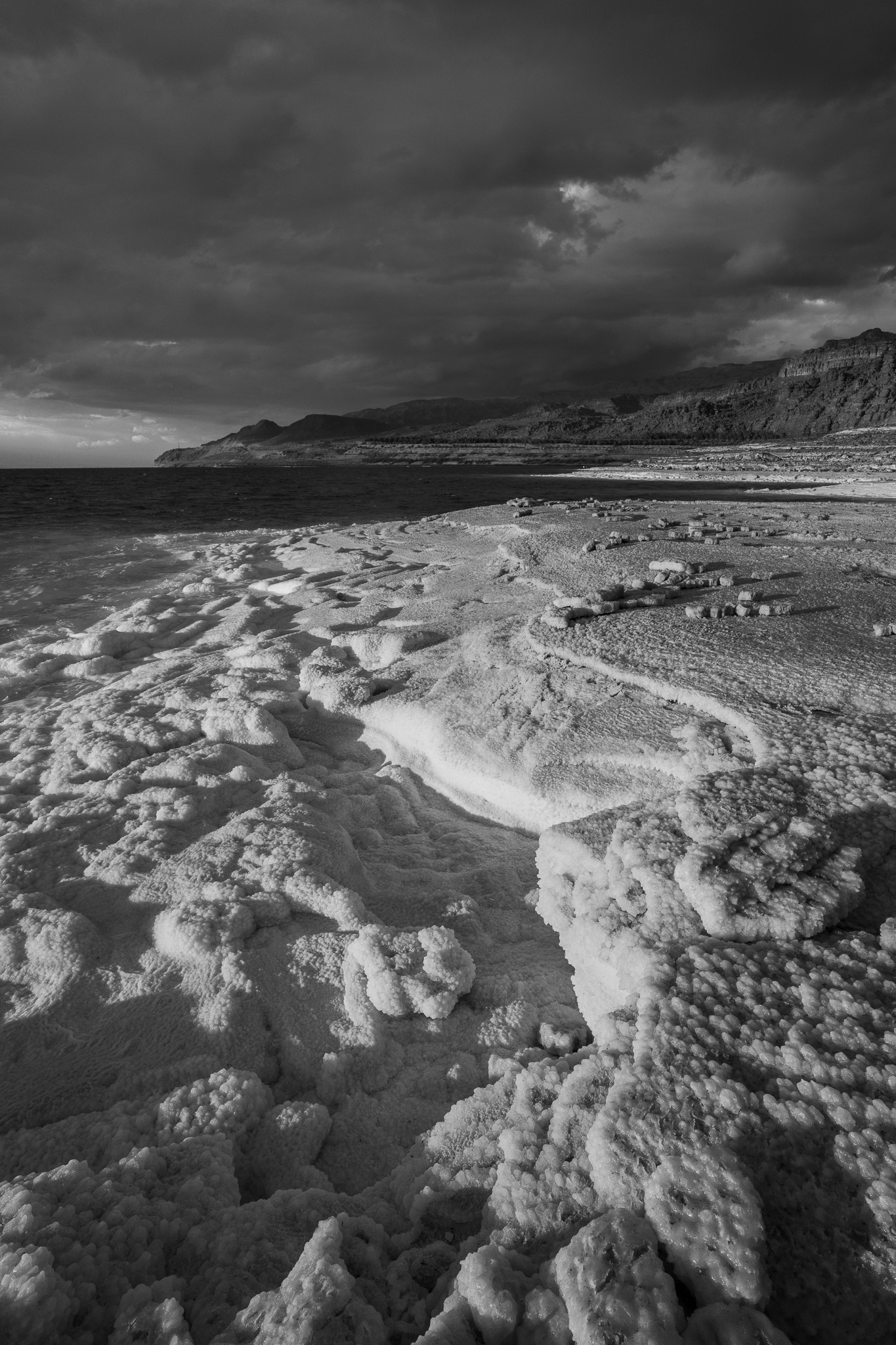
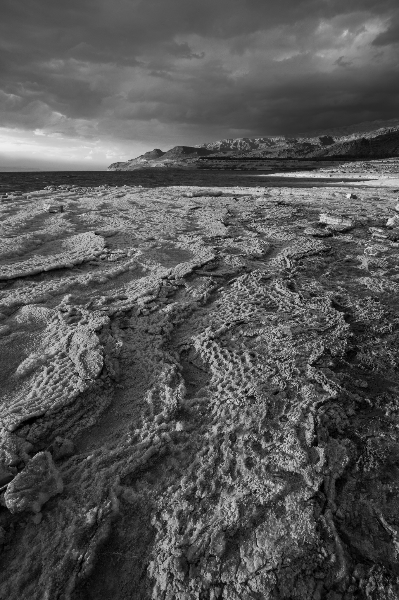
I’ve taken so many photos with this effect that it’s hard to choose just one to show below. But the first example that comes to mind is the following photograph, where the deep color blue adds a somber, ominous quality that sets the entire foundation of the image’s mood:
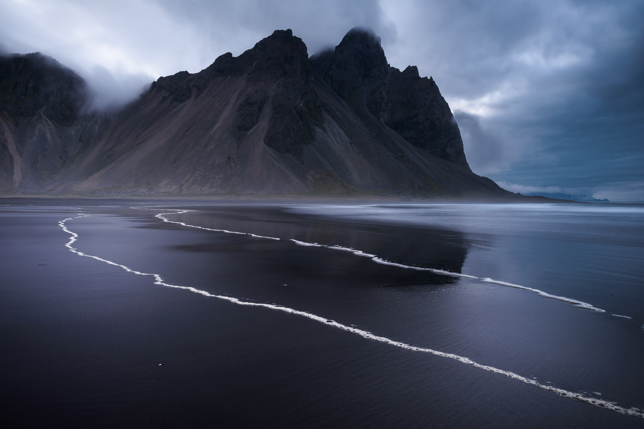
Meanwhile, the black and white variation still looks ominous. And there aren’t any significant color contrasts in this scene, so there’s no issue with subjects blending together in the photo below. But because it lacks that powerful contribution of the color blue, it just looks flatter and doesn’t convey as powerful of a mood.
When taking a picture (and editing it), always ask yourself what emotions the different elements in the frame are conveying. If the colors convey an emotion that helps your photos’ mood, it’s usually best to keep them rather than converting to black and white.
You Need Realism
Whether for personal reasons or for some outside client or project, some photos just need to be in color. For example, if you’re making a print for a wall in your house, the colors (or lack thereof) in the print will need to complement the room’s existing decor. Or, maybe you’re simply doing something like real estate photography where the client requires color images for their listing.
This situation is self-explanatory, so I won’t spend any further time on it. You be the judge, but sometimes you just need a color photo, no matter if the black and white version looks good or not.
Ambiguous Cases
Naturally, not every photo will fall clearly in one of these directions or the other. I’ve taken some pictures where the color looks muddy or uninteresting, yet still provides a useful color contrast that gives the subject its shape and texture. Other times, the two variations of the image – color and black and white – both look good but simply suggest different moods. It’s left to me to choose which mood I prefer, and it isn’t always an easy decision.
Here are the examples I tend to show to illustrate this point:
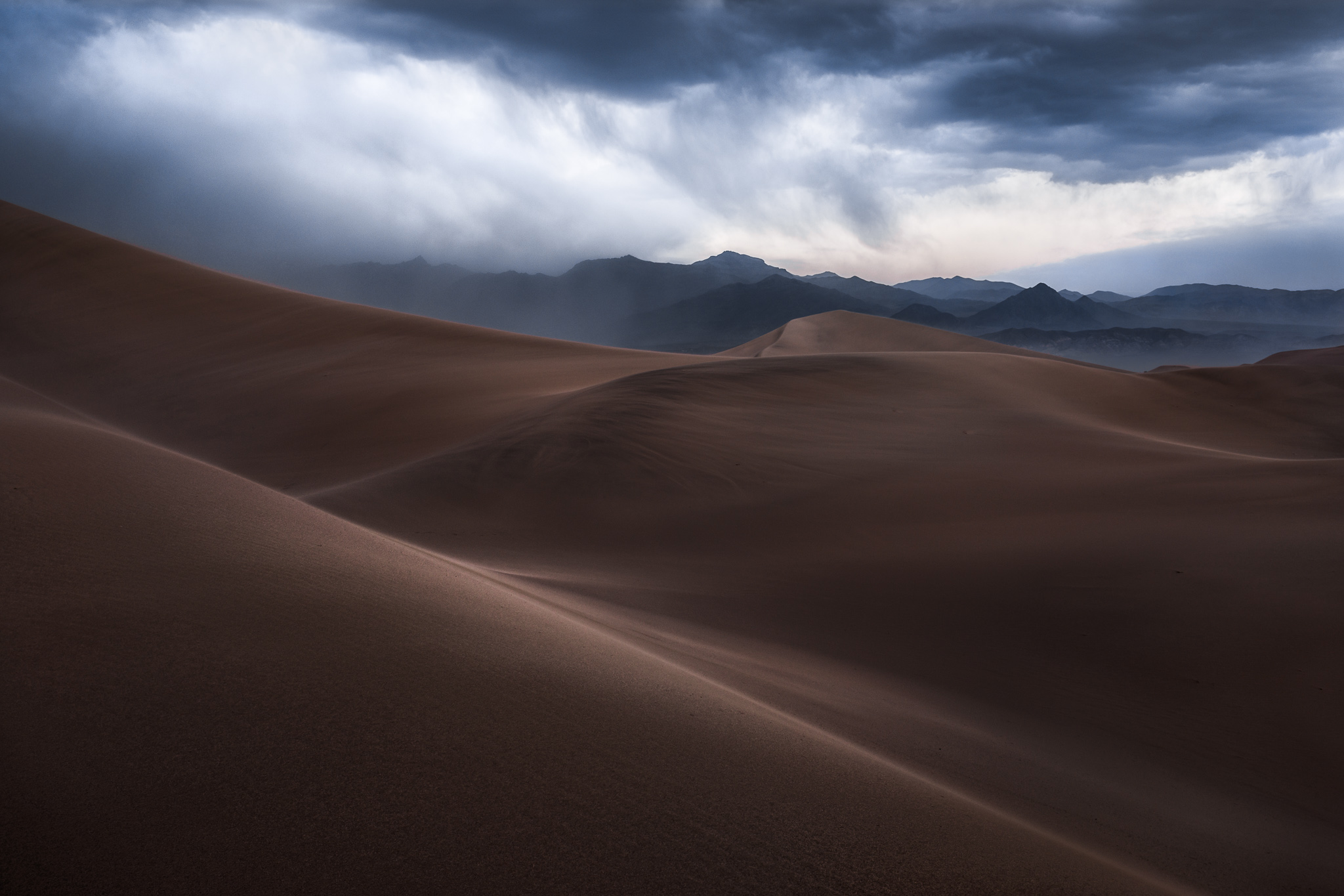
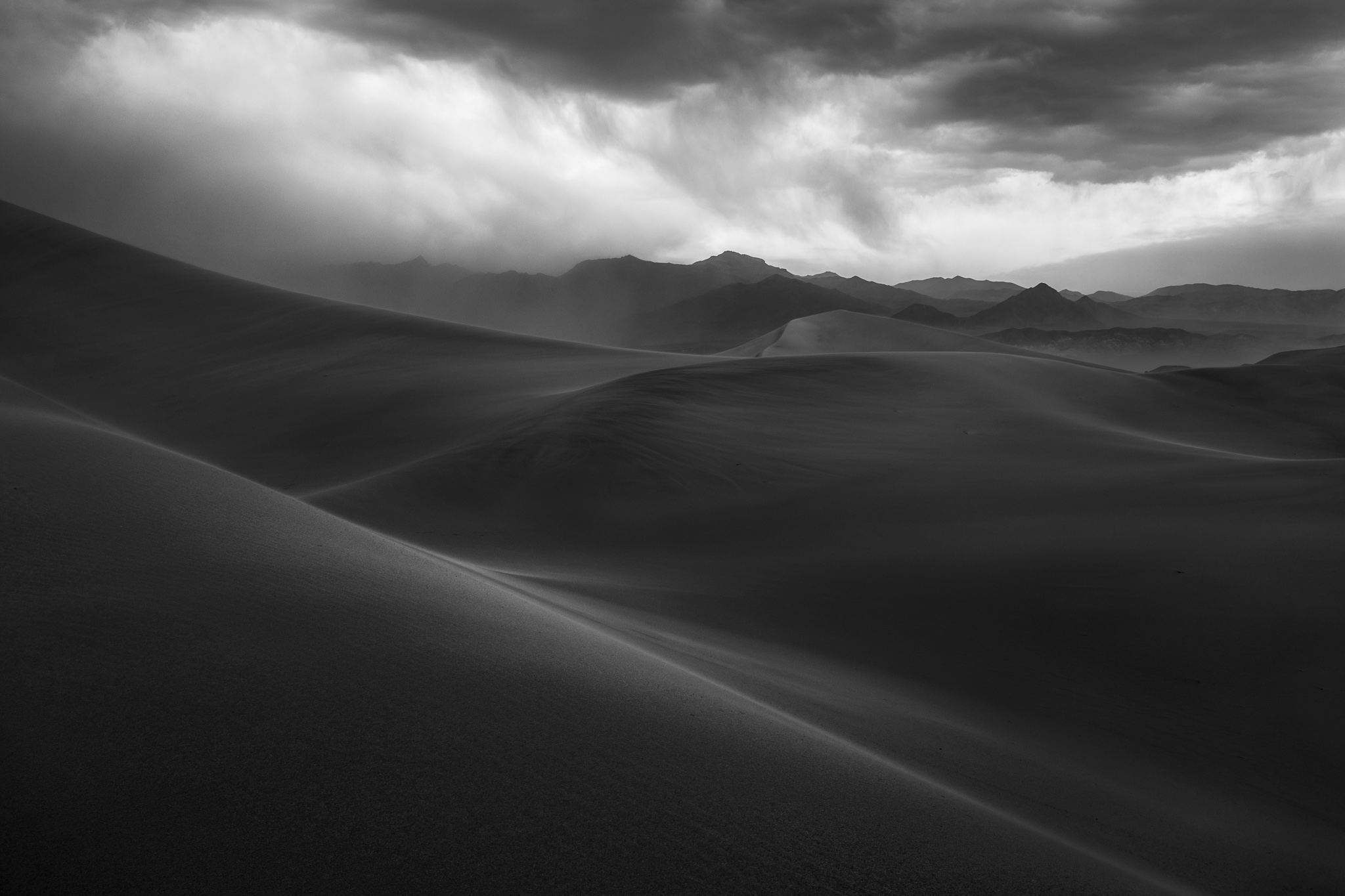
Which do you prefer?
I like that the color image does a better job separating the sand dunes from the mountain in the distance. That same degree of separation isn’t feasible to capture in black and white, because I would need to brighten either the dunes or the mountain too much, harming the photo’s intense mood.
But I don’t like some of the specific colors in the color version, especially the tones in the sky. I chose to decrease the sky’s saturation to preserve the sense of a dark storm cloud, but it’s made some of the colors a bit too dull. (If I increased saturation and got a brighter, bluer sky instead, the photo’s mood would be harmed again.)
Ultimately, my preference is usually to display the black and white variant of this image, in part because it feels more “primal” to me and evokes more of the mood that I want. On the other hand, a majority of people who view both images (at least in my past experience) have preferred the color variant, perhaps because of the stronger subject separation. So, the “better” image here is up in the air.
It goes to show that much of photography is subjective and down to the photographer’s own choice of interpreting a subject. In ambiguous cases like this, I encourage you to go with your gut – and, further, to not be afraid to re-evaluate which variation you prefer over time as your vision changes.
Conclusion
I hope this article gave you a sense of the decision-making process behind black and white photography. Of course, these decisions don’t always need to be made consciously. Sometimes it’s as simple as flipping between the color version and the monochromatic version of an image and having an immediate, obvious preference for one of them.
But I think it still helps to approach this process with a thoughtful, deliberate eye. For instance, if you don’t like the black and white version of a photo at first glance, maybe the underlying reason is that there isn’t good subject separation. Upon realizing that, you can perform local adjustments (including changing the photo’s B&W mix) to get some separation back, and maybe you’ll decide on the B&W version after all.
I find that I go through gradual phases where my photography leans more toward color or more toward black and white. Right now I’m in trending in the direction of black and white. So, if you have any thoughts to share about black and white photography or how you make this decision either way, I’d love to hear from you in the comments section below.

