


When it comes to digital images, there are two main types: 8-bit and 16-bit. The difference between them lies in the amount of color information they can store. An 8-bit image can store up to 256 shades of each color, while a 16-bit image can store up to 65,536 shades of each color. This means that 16-bit images can display more subtle variations in color and tonality, making them ideal for professional photography and graphic design. However, they also take up more storage space and require more processing power to work with.InsertRephrase
The term bit is common in any form of digital media. With respect to digital imaging, bit depth goes by many names like pixel depth or color depth. In digital photography, the debate of 8-bit vs 16-bit files has been going on as much as Nikon vs Canon. This article intends to give you a better understanding of what bit depth is. It will also take you through whether we need 16-bit images or not, and if we do, when we need them.
What is bit depth?
Most of us are aware of the fact that pixels are basic elements of any image. Specifically, any color in digital imaging is represented by a combination of red, green, and blue shades. One such combination is used per pixel, and millions of pixels make an image. It is for this reason that bit depth is also known as color depth. For example, pure red is represented with the numbers “255, 0, 0.” Pure green is 0, 255, 0, and pure blue is 0, 0, 255. In digital photography, each primary color (red, green or blue) is represented by an integer between 0 and 255. Any non-primary colors are represented by a combination of the primary colors, such as “255, 100, 150” for a particular shade of pink.
Let us consider the largest number that represents red, which is 255. When I convert 255 into binary, I get 11111111, which is eight digits long. Now, when I try to convert the next decimal, 256, I would get 100000000, which is a 9 digit binary number. That is why any integer between 0-255 is considered “8 bit”; it can be represented within eight binary digits.
So, the definition of bit depth is the number of bits used by each color component to represent a pixel. For example, 8 bits can represent up to 256 shades (or, 2^8) of a given primary color.
Bit depth vs Color gamut
Some photographers confuse color depth with color gamut. Color gamut is a range of colors, usually used in the context of which range of colors a given device can display or printer can output. Electronic devices and printers are not able to display nearly as many colors as the human eye can see. The range of colors which they can display is usually limited to a color gamut like sRGB or AdobeRGB, or a specific gamut based on the printer/ink/paper at hand. You can read more about color gamut at Spencer’s article on sRGB vs Adobe RGB vs ProPhoto RGB.
Bit depth, on the other hand, can be visualized as the distance between colors within the gamut. In other words, you could have two images of rainbows that both go from red to violet – i.e., the same gamut. But the first rainbow may be a gentle gradient with many thousands of individual colors if you zoom in on the pixels, whereas the second rainbow may be made up of just seven or eight colors and look much blockier. In that example, the second rainbow would have a much smaller bit depth.
1-Bit images
To visualize bit depth more easily, let us take a simple example of a 1-bit image. As you may have gathered already, bit depth is merely 2 to the power of that number. So, a 1-bit image can have only 2^1 values. Since 2^1 = 2, there are only two values available here: 0 and 1 – AKA black and white.

Take a look at the image below for a similar example. The left side of the image is 8-bit whereas the right side is 1-bit.
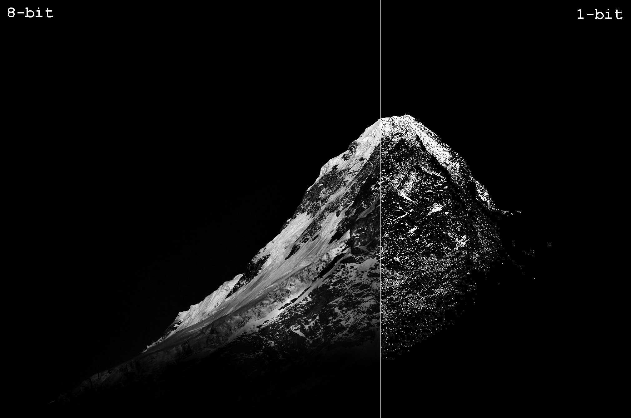
The right side of the image contains only black and white. A few areas of the 1-bit image might appear grey, but once enlarged to pixel peep, the difference becomes apparent as seen below. The 8-bit image can hold 256 shades of grey whereas the image on the right can only hold either black or white.
Bits vs Bits per channel
In the above section, we saw that an 8-bit image can only hold 256 different shades of grey in total. But I mentioned at the start of this article that 8-bit color images actually have 256 shades per primary color. So, a standard color image that we commonly call “8-bit” actually can fit well more than just 256 shades. It’s more accurate to call it an 8-bit per channel image. If your color image has 8 bits per channel, and there are three channels (red, green, and blue), the overall image can actually fit a total of 256 × 256 × 256 shades, which equals 16,777,216 (or 2^24). That’s why you may occasionally hear an 8-bit per channel image referred to at a 24 bit image, even though this is not the most commonly used term for it.
Still confusing? Let me take the help of Photoshop to make it clear. Take a look at the illustrative image below.
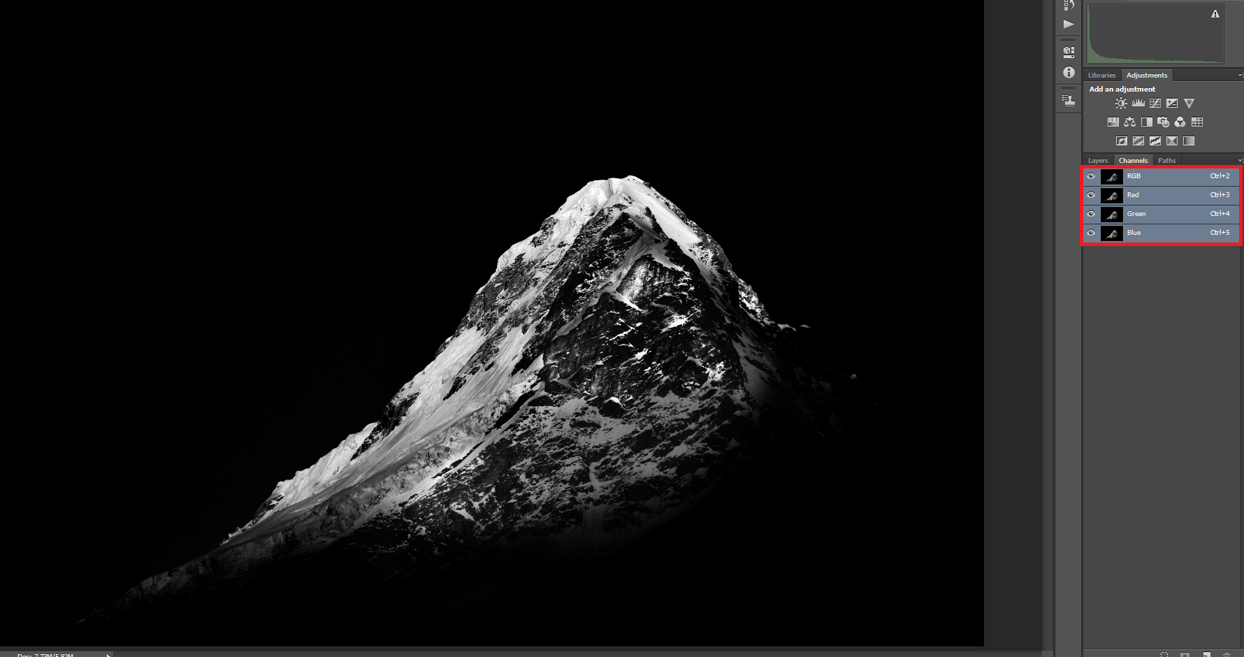
In the Channels tab, marked red in the image above, you can see that even though this is a greyscale image, it has four channels: one channel each for red, green, and blue, and an RGB channel for the entire image. It’s not possible to know whether I can recover the color image in this case (for all we know, I applied a B&W adjustment layer and flattened the image). But at least in some form, there remain three primary color channels here, and each one has eight bits of information.
As such, the entire image here is technically still 24 bit. However, I could delete all color information by going to the top menu and selecting Image > Mode > Greyscale. Once I do, you will see that only one channel exists now, as shown in the picture below:
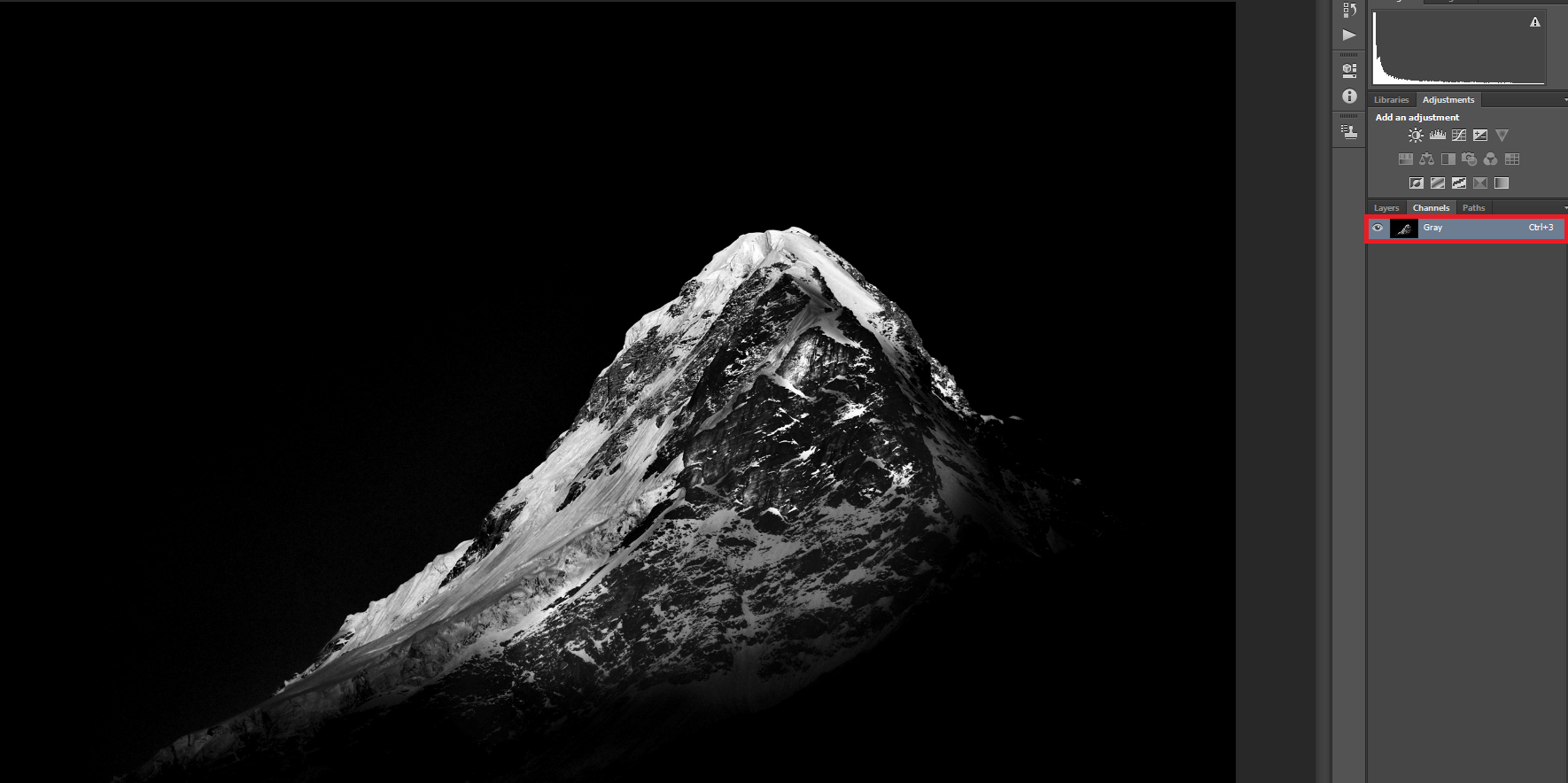
The picture above is a true 8-bit image; there are only 256 shades of gray in this photo, and there is no way to get back the color version. This also reduced my file size to 1/3 of what it was before.
16-bits/channel or 48-bits RGB
Now that you understand bit depth, you can easily calculate the bit depth of 16-bits per channel images. An image with 16 bits per channel will have up to 2^16 shades per channel, or 65536. If you have an RGB image where each of Red, Green, and Blue has 16 bits, you must multiply 65536 × 65536 × 65536 to see that the image can hold up to 281 trillion colors in total.
Even though theoretically, 16-bits/channel bit depth is supposed to hold 281 trillion colors, Photoshop’s 16-bit does not hold that much. As per definition, the maximum possible tonal value for each of the primary colors should be 65,536. But the maximum possible number of tones in Photoshop’s 16-bit/channel RGB is (2^15)+1=32769. So when you are working with Photoshop in 16-bit mode, a pixel can hold any of 35.2 trillion colors instead of 281 trillion.
Is 16-bits/channel really usable?
Even though Photoshop’s 16-bit/channel images can only hold 12.5% of the theoretical maximum value, 35.2 trillion colors is still a lot. The million dollar question that arises now is, can the human eye resolve so many colors? The answer is NO. Research has shown that the human eye can resolve a maximum of 10 million colors. Take a look at the image below.

Can you see any visible difference between the three rounded squares? Most of you might notice the tonal difference between the one in the middle and the one in the right. But I certainly cannot find any visible difference between the left one and the middle one.
The leftmost square is 255, 0, 0, while the middle square is 254, 0, 0. That’s one step of difference in an 8-bit image, nowhere near even Photoshop’s 16-bit images! Had the above image been a 16-bits/channel image in Photoshop, you could fit more than 32,000 tones between the left and center images.
Since 16-bits/channel images hold an exceptionally large number of colors, they obviously are space consuming. For example, Nikon’s NX software outputs 130 MB TIFF files when I choose to export it as 16-bit, whereas, the file size shrinks to about 70 MB when I choose 8-bit with one of my images.
In addition, very few output devices – monitors, prints, etc. – can display more than 8 bits per channel anyway. But that doesn’t mean the higher bit depths are unimportant.
Where does 16-bits/channel really matter?
The section above might give an impression that no one would ever need more than 8 bits per channel. Nevertheless, 16-bit images have their uses. Let us consider the image below.
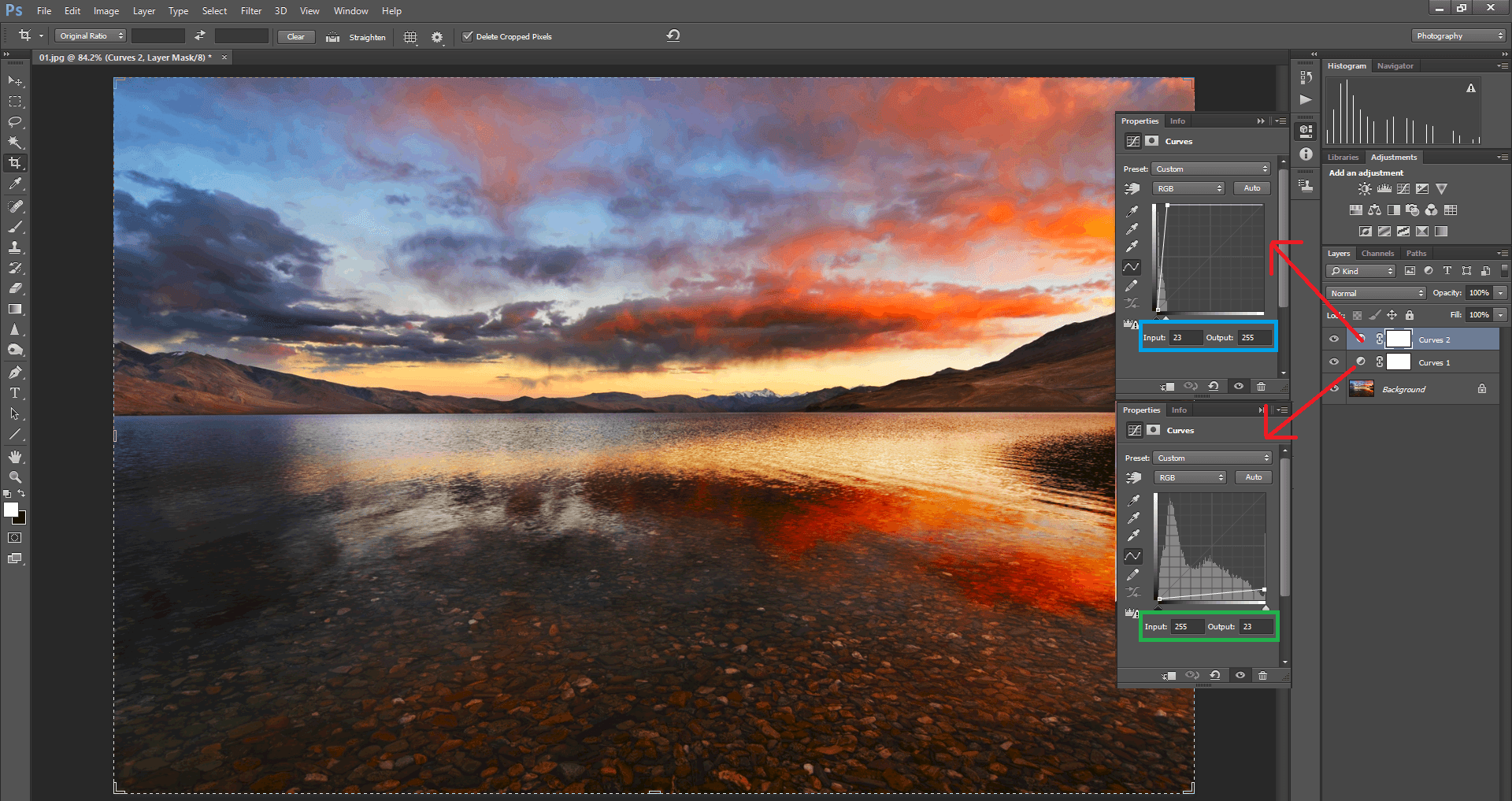
I have opened an image and converted it into 8-bit by using the menu option Image > Mode > 8-bits/channel. Now I apply two curves adjustment layers to the opened image. In Curves 1, I select input as 255 and change the output to 23. To put it simply, I have underexposed the picture. Using Curves 2, I have selected the input as 23 and changed the output to 255. This brings back the exposure to where it was before underexposing it – but at the expense of “crunching” a lot of colors. This leads to the banding effect that you can see in the sky and clouds in the image above.
When I do the same edit to a 16-bit image, there is no visible banding in the sky. You can see that in the comparison below, where I put both images through the same adjustments:
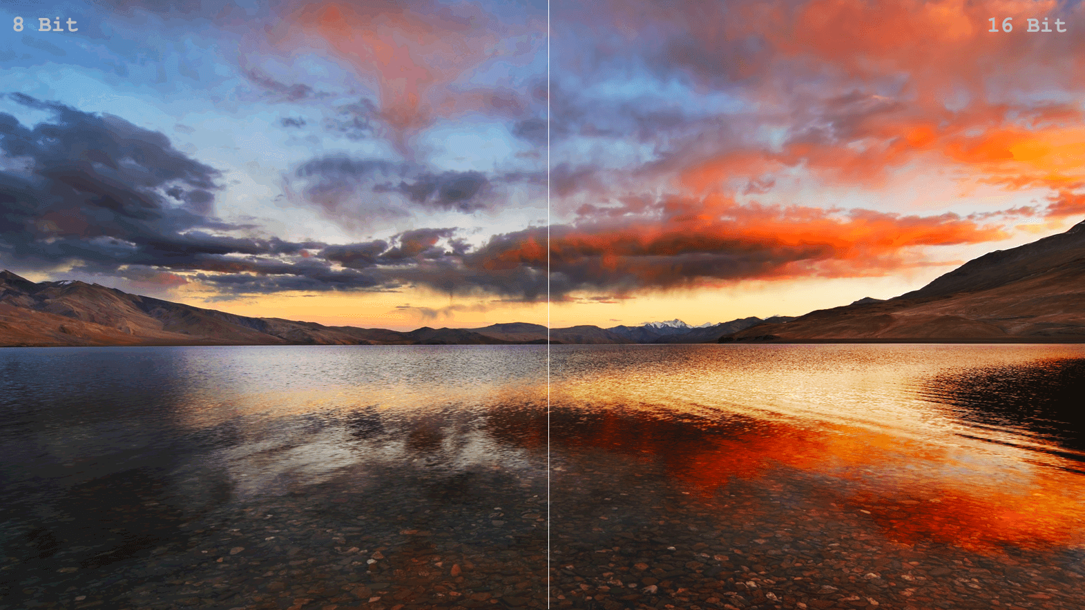
This is where 16-bit images find their use. The more drastic your editing is, the more helpful it will be to have as many shades of color as possible.
You can still avoid banding on 8-bit images with careful processing – such as not doing the extreme curves adjustments I did above – but 16-bit images give you more room for error. That’s why, if you’re editing in software like Photoshop, it is good practice to work with 16-bit images. Only once the editing work is done is it a good idea to convert it to an 8-bit image for output. (Although it’s still best to keep the 16 bit TIFF or PSD in your archive, in case you decide to do more editing later.)
So, in general, the useful scope of 16-bit per channel images starts and ends with post processing.
Conclusion
I hope this article gave our readers a basic understanding of what bit depth is and the difference between 8-bit and 16-bit per channel images. Even though 16 bits may sound like overkill, we saw here that it finds its use in post-processing images. But 8-bit per channel images take up much less file space, so it’s worth exporting your images, especially for the web, to 8-bit per channel to save space.
Please let me know in the comments section if you have questions or additions so that other readers can benefit from it.

