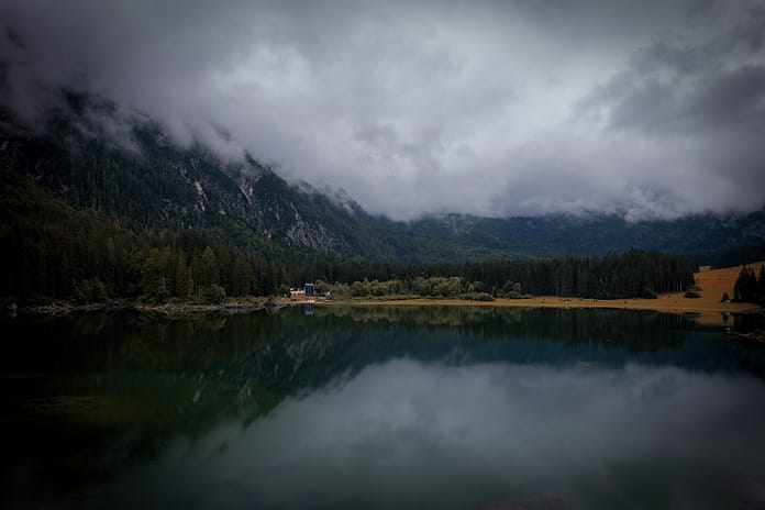
Composition is critical. If you want to take powerful photos, it’s one of the most important parts of photography. Still, a lot of photographers start out only hearing about the rule of thirds, and they never go more in-depth on how to compose better photos. The good news is that you can learn more about composition – and you should. It’s a deep topic, and there’s no way to cover everything in just one article, but I’ll do my best to hit the biggest points below, in this chapter of our Photography Basics guide.
What is Composition?
Composition is the structure of a photograph. It’s how you arrange the elements in your image to create the look you want, and it can make or break an image. If you stumble upon an interesting subject — no matter how good the light is, or how unusual the conditions are — you still need to compose the photo well if you want a successful result.
You have an absurd amount of power to change the composition of a photo. Move forwards and backwards, left and right. Change your lens — zoom in, zoom out. And pay attention to which elements of the scene you’re including, as well as the ones you’re not. Done right, composition takes your subject and presents it to your viewers as effectively as possible. It is the mechanism for conveying a message with your photos.

I chose this composition very carefully to frame the crab between the pieces of grass.
The Elements of Composition
Points, lines, and shapes.
At the most fundamental level, those are the elements of composition. Anything in your image – your subject, the background, tiny details that don’t even matter – are all points, lines, and shapes. Some of them are very complex, of course. A face or a tree clearly are not simple things. But they still have a shape, and they can help form the structure of an image.
On top of individual elements in a photo, there’s also the way they interconnect with one another. Several elements of a photo, arranged properly, are stronger than the sum of their parts.
To make this clearer, take a look at the photos below. These are side-by-side comparisons of a successful photograph along with its component parts. The first example is a photo from Yosemite. Based solely on the line drawing, you can see that the composition is very balanced, with equal amounts of interest on both halves of the frame. Drag the slider back and forth to see the before/after comparison:

The next photo, from Death Valley, has a more dynamic composition, with strong diagonals running the length of the photo:

Last is a photo from Jökulsárlón in Iceland, with a block of ice washing ashore. Here, you can see the lines and shapes that form the structure of the photo:

To me, the interesting thing so far is that these three line drawings still work well on their own, and they maintain a similar emotional mood as the original image. I wouldn’t hang them on my wall, of course — but they have a certain internal structure, even as simple as they are.
When I’m out taking photos, do I actually imagine my subject as a set of black-and-white lines? I’d be lying if I said that I did. What I do think about, though, is arranging a good structure — which, deep down, has its roots in fundamental elements like lines and shapes.
Intent
The big secret of composition is not that you should follow one structure or template for a majority of your photos (which is what the rule of thirds suggests). Instead, the important thing is to pick your composition intentionally.
Intent is the most important part of composition. Nothing in the photograph should happen by accident. Everything must have a reason to exist. If you remember that, and you really spend time in the field making it happen, your photos will skyrocket in quality. It’s almost impossible to avoid since you’ll end up putting more conscious thought into how a photo appears.
Simplicity
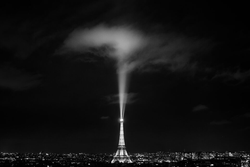
Every photo you take has an emotional message — the core reason why you chose to take a photo in the first place. When you’re out taking pictures, one of the best things you can do is consciously think about the emotional message, and hone in on how you want to express it. That’s where the power of simplicity comes in.
Simplicity means that nothing in your photo takes away from the emotional message. If you’re trying to convey a sense of beauty at a landscape, eliminate everything from the photo that isn’t beautiful. That could be power lines, footprints in the foreground, a piece of trash in the frame, and so on.
At the same time, simplicity also refers to your composition. Don’t overwhelm your viewers with too much information, unless your goal actually is to capture an overwhelming, chaotic photo. When your photo tells the story you want without any distractions, it will be as powerful as possible.

No element in this photo takes away from my message. Every part exists for a reason.
Balance
One of the main things I think about when composing a picture is balance.
Balance is fairly easy. To start, all you need to do is ask yourself how much attention each element in the image attracts. This is known as “visual weight.” Objects that have high levels of visual weight include bright objects, saturated colors, eyes, people, animals, high contrast, and unusual elements — anything that attracts attention in the real world. Then, figure out if the visual weight is distributed evenly across the frame, or if one half of the photo has more than the other (from left to right). If they’re roughly even, it’s a balanced photo. If not, the photo is imbalanced. (Neither is necessarily better than the other.)
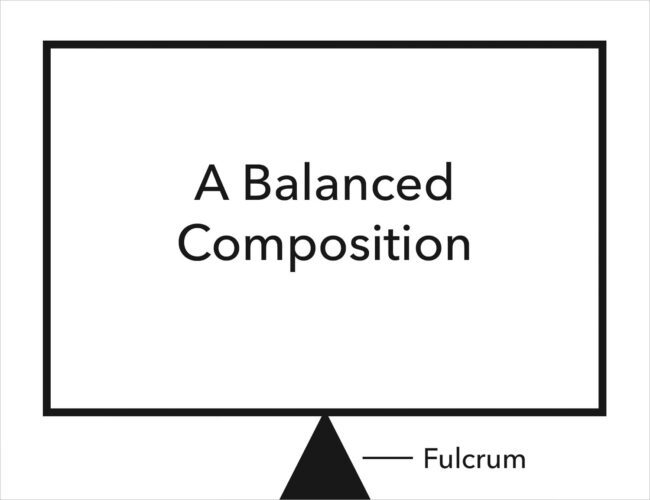
This works a lot like a seesaw, including the fact that you can balance a “heavy” object — your main subject — with a “lighter” object, so long as the lighter object is farther to the edge of the photograph (just like balancing a child and an adult on a seesaw). Take a look at the photo below:

The dragonfly has more visual weight here, while the silhouetted plant in the background has much less. But the plant is right against the edge of the frame, while the dragonfly is nearer to the center. So, overall, this is a balanced photo.
In photography, you have the choice to capture balanced photos or imbalanced photos. Neither is better than the other. What matters is that they both convey different emotions.
- Balanced photos are peaceful, static, and calm
- Imbalanced photos are dramatic, tense, and dynamic
If you’re photographing a gentle lake at sunrise, you might not want an imbalanced photo. But, with more intense subjects, it could be the perfect composition. It just depends upon the mood you’re trying to convey.
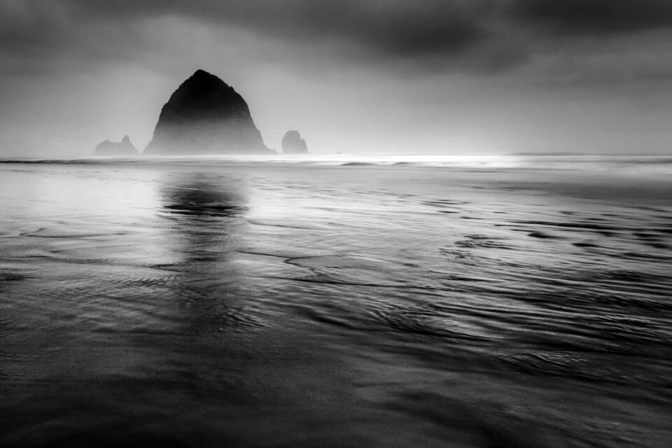
This image is imbalanced to the left. That makes it more dynamic and intense, which works well here.
Breathing Space
When there are multiple points of interest in a photo, you may want to give them “breathing space” by spacing them apart from one another. Otherwise, elements of your photo will interfere with one another (or the edges of your frame), making for a sloppy composition.
Think about a scene where a few birds are flying through the air, and you want to capture all of them in a single photo. If one bird crosses in front of another, though, that area of the image will look messy and unintentional. It’s better, instead, if all your subjects have some space to breathe — between one another, and between the edges of your image.
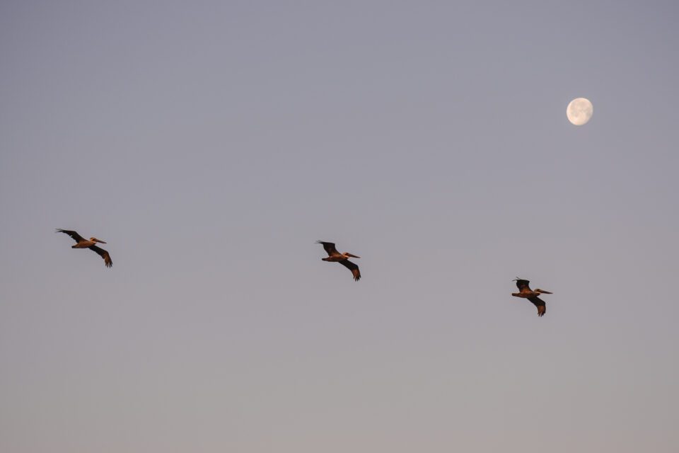
All of my subjects here have plenty of breathing space.
The same goes if you’re photographing a mountain, and the peak is almost touching the very top of your photograph. In that case, it will draw unwanted attention and potentially demonstrate a sense of carelessness. Instead, it tends to work better if your subjects each have room to stand on their own, unobstructed by anything else in the photo. That helps you send a strong, cohesive message to your viewers.
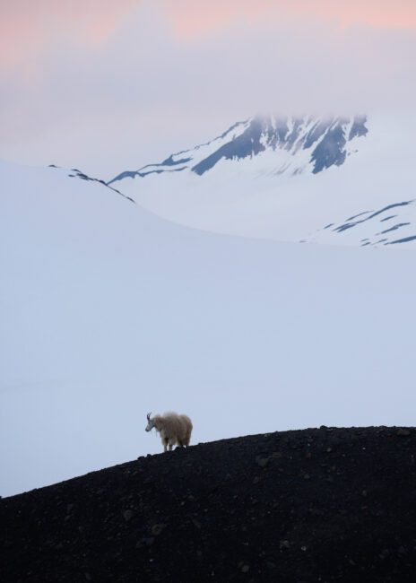
No important object is bunching up against the edge of the frame, and my main subject (the mountain goat) has plenty of breathing space.
Positive and Negative Space
We’ve already covered positive and negative space, but it bears repeating here.
Positive space is anything in your photo that stands out and attracts attention. Negative space is the opposite — areas of an image that fade into the background and don’t draw the eye. You can take photos with high amounts of negative space, high amounts of positive space, or somewhere in between. They all convey different emotions.
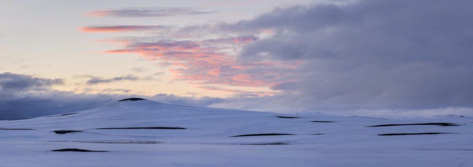
Photographs filled with negative space have a sense of emptiness, peacefulness, and isolation. They tend to be somewhat minimalist images, and they work well when you’re trying to show a sense of scale or loneliness. A single tree in a snowstorm would qualify, and so would the photo below:
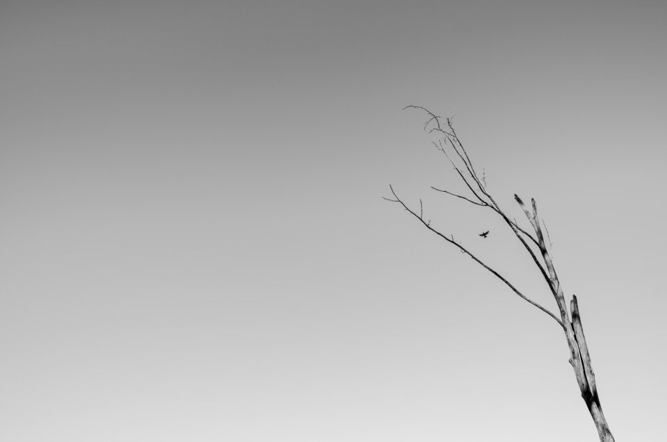
Because of all the negative space, this image conveys a sense of isolation.
Photos with a lot of positive space are more intense, busy, and active. They include lots of little details for your eye to notice, although the downside is that they can appear crowded — harming the simplicity and clarity of your message — if you aren’t careful.
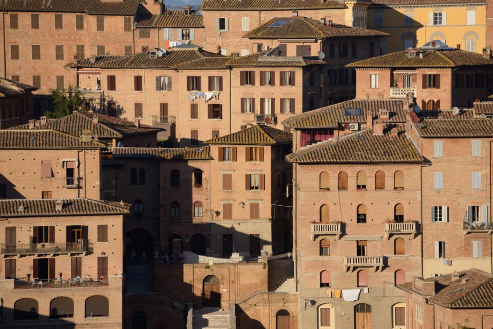
This photo has a lot of positive space, making it feel busier and more active.
These emotions are very important to your composition, and they help form the message that you want to send. If you’re paying close attention in the field, you can move around or adjust your composition in order to alter the ratio of positive space to negative space. Because of the different emotions they convey, this is a great tool to have at your disposal.
Patterns and Relationships
In some cases, with care, you can capture photos that have more intricate patterns and relationships than just a simple composition. For example, you might photograph a landscape with an orange flower in the foreground, and orange light on distant hills. Or, you could capture a plume of smoke rising from a volcano at night, and matching with the shape of the Milky Way overhead.
There’s no end to the world of deeper relationships that are possible in photography. It’s not something you’ll find all the time, but you should keep an eye out. When a photo has an especially imaginative relationship, it will feel completely interconnected and intentional.
Conclusion
I don’t want to make it seem like composition is easy. In some sense, it’s impossible. Even the greatest photographers of all time never mastered composition, because composition isn’t the type of thing you can master.
Perfect composition is not an endpoint that you’re able to reach with enough talent or hard work. It is, instead, a shifting target that depends vastly upon your own, changing qualities, as well as the scene in front of you, and the emotional goal you have in mind. The rule of thirds won’t get you there. It’s a simple technique, mainly meant for beginners, and it only scratches the surface of what composition can be. The same goes for any other simple tip out there — none of them apply often enough to overrule the fundamental elements of composition.
Unfortunately, as much as I hate to admit it, that’s also true for reading about these things online. You can’t learn everything about composition from an article or YouTube video; it is far too personal of a topic. Composition is something you must go out and learn for yourself.
Hopefully, though, the tips in this article will give you a good starting point. Very few elements of photography are more important than composition. Done right, it has the power to make your photos truly stand out from the crowd.


